 Working on the Tyranny of Dragons project has been something of a dream come true for me. Like a great many folks playing RPGs today, I grew up playing D&D. As an 11- or 12-year-old avid D&D player and aspiring artist, I used to spend hours marveling at all the adventures and rulebooks, daydreaming about how cool it would be to actually work at TSR when I grew up. Well, I’m all grown up now and I’m lucky enough to work in the RPG industry for some amazing companies and people, Kobold Press and Wolfgang Baur obviously heading up that list! However, for the 12-year-old D&D fan still very much inside of me, getting to work on an official D&D product, not to mention the very first adventure for the new D&D rules, is positively surreal!
As the primary person choosing the artists, assigning the art, and then working with the artists, I was determined that the art in these books would be as awesome as possible. One of the artists I knew we had to get involved was Guido Kuip. Guido had done lots of work for us in the past and I’ve always enjoyed working with him so I was confident he could deliver. And deliver he did!
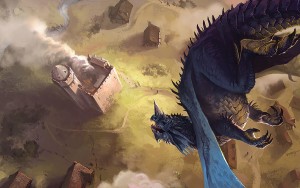
Typically with Guido’s initial sketches, I find many ideas I like. For the Dragon Attack sketches, I thought many of them would make great final illustrations. However, we felt sketch ‘A’ had such a nice feeling of tension, drama, and sense of coming doom for the town that it would make a great illustration.
Once the sketch was picked, Guido went to work on a black-and-white rough, then a rough color study, and then further and further refined color versions. At each point in this process, he received feedback from me and in some cases Wolfgang, Steve, and then eventually, of course, the good folks at Wizards of the Coast.
 At the end of this creative process, we had the amazing illustration you see here!
—Marc Radle, Art Director
It was fun figuring out what angle to pick for the Dragon Attack piece: Do we want to show the effect of such an attack, the panic and destruction, or do we want to show the moments just before the attack? Marc and Wolfgang preferred the sketch that had a more dramatic angle and focused on the dragon poised for attack. After that, it was just a matter of fine-tuning the dragon’s pose and position, and fixing some perspective issues—and of course making sure the dragon matched the reference provided by Wizard of the Coast!
I’ve been working for Kobold Press for a couple of years now, starting out with black-and-white ink sketches for smaller Pathfinder supplements. It’s been interesting seeing them taking on bigger projects, and I’m excited I got to do a few interior illustrations for the upcoming D&D book!
—Guido Kuip, Artist
Hoard of the Dragon Queen is available in an exclusive autographed collector’s edition with a Queen of Dragons unit patch available only through Kobold Press.


Awesome work Guido!
That’s an amazing picuture, well done guys! Let me know when the miniature comes out :-)
The first time I saw the pic it literally gave me vertigo!
I really like this piece. It reminds me a bit of Wyeth’s Soaring in its unusual perspective. Wonderful motion in the dragon. I can feel the pumping if the wings as it dives.
It would be really cool if Kobold Press could partner with a print on demand service to make art prints and posters of some of the wonderful covers and interior pieces from KQ and other works.
If you have a print service you’d recommend, we’re all ears. Though not for this particular piece, of course, as that art is (c) Hasbro.
But we do have cover art and some great pieces that might do well as prints and posters. We just lack the time to attempt that ourselves.