 Working as art director on the Deep Magic project is a blast! In particular, working with cover artist Marcel Mercado was a creative delight, and I am THRILLED with what he came up with.
Initially, my direction to Marcel for the cover basically focused on Midgard magic (blood magic, rune magic, shadow magic, and geomancy). I also stressed that I wanted a bright, colorful cover image that is lively, dynamic, and full of action. I noted that a cool-looking menhir (standing stone) with runes carved was an important part of the image. Ley lines were another element we needed, which I suggested might be represented as glowing lines on the ground, radiating out from the base of the menhir. Of course, being a book all about magic, we needed a spellcaster, so I asked for a wizard of some sort (one of the Midgard iconics would be a nice touch), casting a spell, with lots of fiery, glowing magical runes in the air around him.
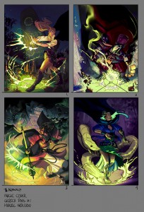
 I was blown away by the rough we received (seen above).
All four had a nice sense of action and movement, and they really captured the feel we were going for.
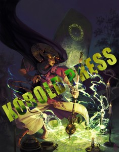
I like rough #1 best of all, in particular the menhir and the ley lines, although I liked aspects of the other three as well. So I worked with Marcel to incorporate the best parts of all four roughs into a single, awesome cover image. You can see where we are with that in the second image sneak peek I’m posting here.
After I had the final, high resolution image in hand, I worked on the actual cover.

Oooooh! That cover is looking nice!
Yeah, it really is beautiful!
Just wait until you see it in person on the book cover (or as a high quality print, for those backers that get that is a reward!)
Now I’m even more pleased I moved to a tier with the high quality print. Good job Marcel and Marc.